


How a Lightweight Design System Can Help Your Business Move Faster with AI
The following article is offered for informational purposes only, and is not intended to provide, and should not be relied on, for legal or financial advice. Please consult your own legal or accounting advisors if you have questions on this topic.
At Flex, we're a small engineering team known for punching well above our weight class, with a huge bias towards action. After a few years of rapid product changes and pivots, we'd accumulated a significant amount of UX debt that started to show a clunky experience.
We still needed to ship quickly, but with a much higher bar for quality and a shared understanding of what “quality” actually meant. However, when the idea was floated my way around creating a design system, I went into lowkey panic mode.
Having built two design systems previously, I knew the pitfalls they can entail: unnecessary custom work, bikeshedding, outdated docs, etc. We didn't have the time or resources to get caught up in the baggage that design systems can come with.
The Ask
The question quickly became, "How can we implement a “lightweight” design system — one that delivers value without slowing us down?"
The first thing we had to do was evaluate what a comprehensive design system entailed vs. the lightweight system we were aiming to build.
Normal, Comprehensive Design Systems
- Custom components (buttons, modals, tables, etc.)
- Custom tooling (Storybook setups, internal infra)
- Processes/governance for changes
- High maintenance costs
Lightweight Design Systems
- Only most-used components and patterns
- Easy to adopt — docs and code live where devs already work
- Leverages existing libraries instead of building from scratch (when possible)
- Has standards to showcase usage
Our Constraints: Small team, big aims.
We started with an elegant series of designs that spanned from atomic-level components (buttons, inputs, etc.) to common layouts and multi-step flows.
Throughout this process, we made every effort not to create any new components unless absolutely necessary. Leveraging our chosen tools was imperative. We're a small company that ships a ton of work each week; the last thing we needed was to get caught up in minutiae on custom problems from custom components.
While the visual inconsistencies were clear, a deeper issue I’d noticed at Flex was a lack of a unified approach to building common UIs, like forms. You could go into the codebase and find five different ways we were implementing form UIs. It was clear that we needed a series of standards.
Creating a Series of Unified Standards
We'd previously started working on a ‘cheat-sheet’ section for developers to have a collection of best practices to copy/paste. This became the perfect place to showcase our emerging design system. We could use this area (later renamed as “Playground”) to enable devs to view and use these standards for our most common UIs to jumpstart their work, and also allow designers to see that what they built is actually what’s being used. Finally, having this embedded into our own web app (rather than externally, via a platform like Storybook) helped ensure its usage.
However, the story had just begun. We had a couple of dragons to slay first:
- We were locked into a prior version of our chosen UI library and it would be a fairly Herculean effort to upgrade. This change would span the entirety of both our customer-facing app and our internal tool, Alfred.
- We needed to combine repositories to co-locate our internal and web apps to ensure cross-app design system usage.
After completing those milestones, we re-themed both apps to match the new designs and momentum started to build.
Force multipliers
Upon re-theming our internal tool, Alfred, and the web app, we started to create a series of best practices in Playground. Over time, Playground contained the “80/20” of our use cases — a one-stop shop for components, layouts, and shared utilities.
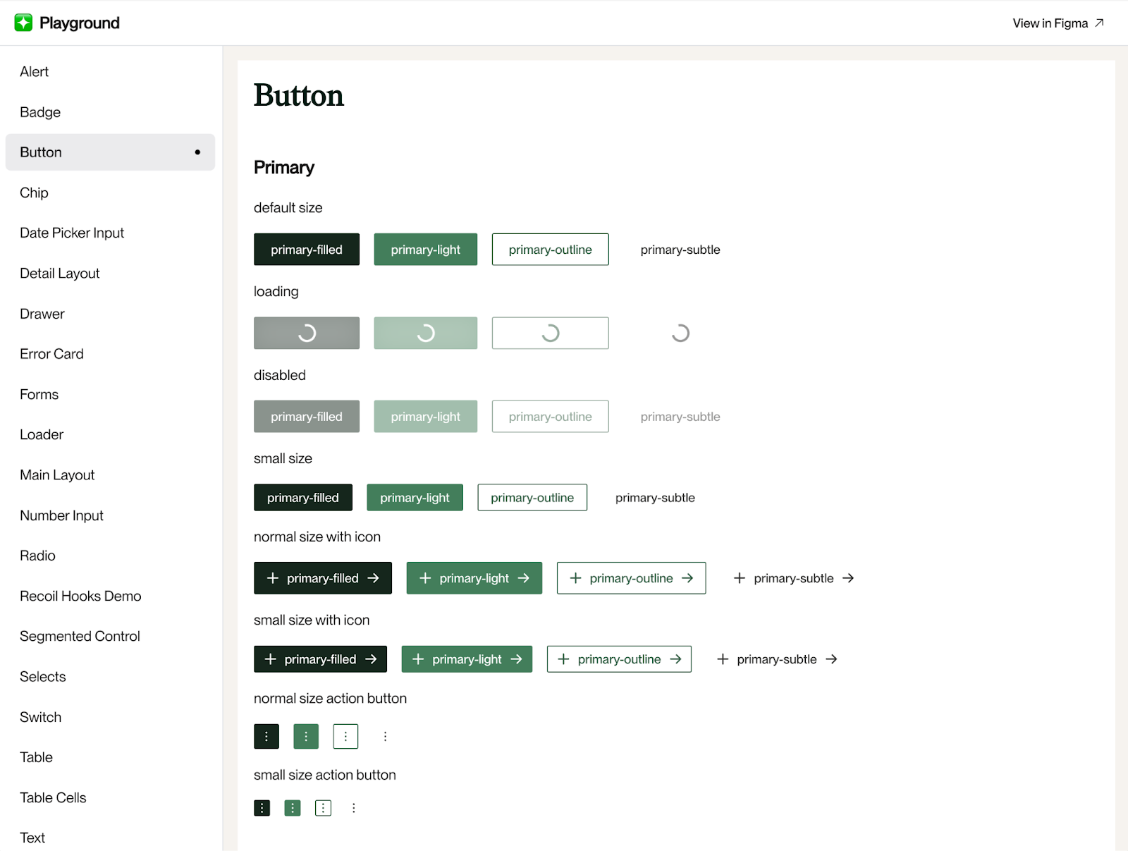
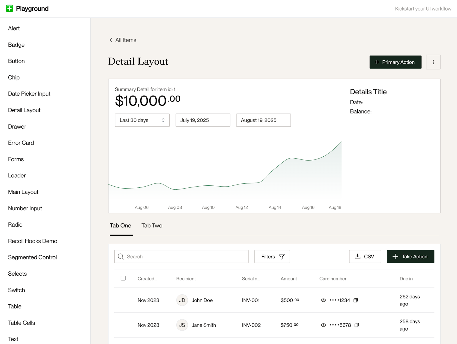
While we knew Playground would be beneficial for developers to copy/paste components to jumpstart work, this collection of standards turned out to be perfect for LLMs to understand how UI code should be generated.
Enter: Cursor
Shortly after we started building Playground, our frontend team began using Cursor AI. We made our Cursor rules reference Playground to use it as a starting point when generating any UI-based code:
- For examples of how to use our design system components, check the Playground at `src/areas/playground`.
- When implementing new components like Drawers, Tables, Wizards, Layouts, etc., copy the file as it's implemented in the Playground and use it as a starting point in the area you're working on.
- Most of the time you will not be updating any files in `src/areas/playground`, but simply using the components in there as starting points to copy over into new folders in `src/areas`.
Our prior re-theming effort paid off tremendously here, as it paved the way for Cursor to build UIs consistent with our design system without having to consult any style guidelines.
To further hone in on “what frontend quality means at Flex”, we codified the standards we’d previously agreed upon as a UI team. Cursor references this in addition to Playground’s rules so that the LLM understands not only what should be built, but how to build it in conjunction with our various tools and conventions. Here's a snippet of how we reference our current UI library, Mantine, from our Cursor rules file:
- Use Mantine as your base React component library.
- Make full use of the Mantine library, including components from `@mantine/core`, hooks from `@mantine/hooks`, forms with `@mantine/form`.
- For components, always try using components in our `components/core` or `components/composites` folders first, otherwise use core Mantine components whenever possible.
- Avoid using inline styling or classes — first always try to use Mantine props for styling colors and background colors, spacing and sizes, etc.
- For colors, always use our Mantine theme colors (ie `theme.colors.yourColorHere[index]`).
- For spacing and sizes, use Mantine's `rem()` function over pixel or numerical values, i.e. `gap={rem(12)}`
Flex Results
Using AI alongside our design system has been a game-changer across the board for creating and maintaining a higher bar for speed and quality. Our recent Accounts Receivable feature was built entirely within three weeks!
Likewise, utilizing Playground as a solid collection of components and patterns has underscored our bar for quality, for both devs and LLMs alike. In pursuing a more lightweight approach to building a design system, we've been able to bypass the numerous pitfalls often associated with design systems, while preserving the advantages of consistency and direction.
Recently, we've used Playground as an educational resource to show how developers can use alternatives to a state management tool that we're actively trying to deprecate. In the near future, we aim to attach our Playground standards to our CI build to further ensure adoption.
Lessons for Other Teams
If you’re early-stage, here’s what we recommend:
- Start small: Focus on your most-used UI components
- Avoid custom work: Most modern UI component libraries can be utilized to jumpstart your design system effort. Save the custom work for more complex components and workflows
- Get specific on what ‘good’ is: Make sure your team has a set of agreed-upon standards around UI tooling and coding conventions so you can codify them with AI tooling
- Make it obvious to your team: Embed your design system in the product to help ensure it gets used
- Make it accessible for LLMs: Make sure your AI tooling can easily reference your design system and standards to ensure alignment before generating code
Final Thoughts
You likely don’t need a custom or complete design system. You need a useful one.
At Flex, our design system has become a multiplier across engineering, product, and design. It’s helped us move faster with a much higher bar for quality.
For early-stage teams betting on velocity and AI tooling, this might be one of the smartest infrastructure investments you can make.


.jpg)
.png)